
A typical italian pizzeria with a typical german name.

To ensure that the rebranding of Haus Mallack was aligned with both staff and management perspectives, I conducted a focus group to gather insights on the restaurant's current brand perception, operational challenges, and opportunities for improvement.
The focus group consisted of 8 participants (5 of them being family members), including servers, kitchen staff, and management, ensuring a diverse range of perspectives.
The session lasted 90 minutes and was held in a quiet, comfortable area of the restaurant to encourage open dialogue. The discussion was recorded with the participants' consent for accurate analysis.

Key Questions:
Insights:
Based on the focus group feedback, I decided to modernize the logo and color palette to better reflect the vibrant, contemporary atmosphere the restaurant aimed to convey. The menu design was also simplified to improve consistency and appeal to a younger audience.
Blendi's Note:
"The focus group was instrumental in guiding the rebranding process, providing real-world insights that ensured the new brand identity resonated with both staff and customers. It reinforced the importance of involving internal stakeholders in the design process to create a brand that truly reflects the business's values and goals."
To align the rebranding of Haus Mallack with the strategic vision of its leadership, I conducted an empathy interview with the CEO.
The interview aimed to uncover the CEO's personal connection to the restaurant, their perception of the current brand, and their aspirations for the future. This understanding was crucial in shaping a brand identity that is not only modern and appealing but also true to the restaurant's roots.

Interview Questions:
Insights:
Blendi's Note:
"During an empathy interview with the CEO, it became clear that the restaurant's legacy and connection to the local community were paramount. Their vision for the rebrand was not just about modernizing the aesthetic, but also about reinforcing the restaurant’s role as a community cornerstone. This insight directly influenced the decision to incorporate locally-inspired design elements and a brand message that celebrates the restaurant’s heritage."
To ensure the rebranding of Haus Mallack (a german named restaurant with an italian cuisine) positioned it effectively in the market, we conducted an in-depth competitive analysis. This research helped us identify key opportunities for differentiation and informed our strategic design decisions.
We analyzed Aposto, Castello, and Winkelmann, focusing on their brand identity, customer experience, marketing strategies, and menü and pricing.

The comparison chart better displays the insights gathered and compere them with Haus Mallack.

Insights:
Blendi's note:
"The competitive analysis highlighted that Haus Mallack’s unique strengths lie in its authentic family involvement and strong community ties, creating a brand identity centered around warmth, personal connection, and heritage. This understanding deepened my perspective of the local dining landscape, revealing that while many competitors excel in modern branding and upscale presentation, they often miss the personal touch that defines Haus Mallack. These insights guided the rebranding strategy to emphasize the familial and community-driven aspects that truly set Haus Mallack apart from more commercially-driven competitors."
Haus Mallack is a well-established dining venue that has been serving the local community for 5 years. Known for its italian dishes (especially Pizza) the restaurant has built a loyal customer base. However, in recent years, there has been a noticeable decline in customer engagement and foot traffic. The current brand identity, including the logo, menu design, interior decor, and online presence, no longer resonates with the target audience, and the restaurant is struggling to compete with newer, trendier establishments in the area.
Challenges:
Objective: The objective of the rebranding is to revitalize Haus Mallack by creating a cohesive, modern, and appealing brand identity that resonates with both existing customers and a new, younger demographic. The rebrand should reflect the restaurant’s commitment to quality, innovation, and customer experience while differentiating it from competitors. This includes updating the logo, color scheme, typography, interior design, menu layout, packaging, and digital presence to create a unified brand that is visually striking and aligned with the restaurant’s values and market positioning.
Success Criteria:


During the rebranding process for Haus Mallack, Persona Prioritization was a crucial step in the defining phase. This process involved identifying and prioritizing key customer personas to ensure that the rebranding strategy aligned with the most valuable audience segments.
We evaluated various personas based on their alignment with Haus Mallack’s core values of family, authenticity, and community, as well as their market potential, loyalty, and accessibility. This helped us focus our efforts on the personas that not only represent the current customer base but also offer the greatest potential for growth and engagement.

Blendi's note:
"By focusing on these top-priority personas, the rebranding strategy was tailored to enhance the dining experience with a more inviting and cozy atmosphere, deepen community engagement, and strengthen the restaurant’s online presence. This persona-driven approach ensured that Haus Mallack's rebranding was not just about visual changes, but about creating meaningful connections with the people who matter most."
To create a logo that truly reflects the brand identity of Haus Mallack, I began by conducting a thorough competitive analysis within the restaurant industry. This helped me gain insight into key visual trends and branding strategies. From there, I identified three guiding questions for the logo design:
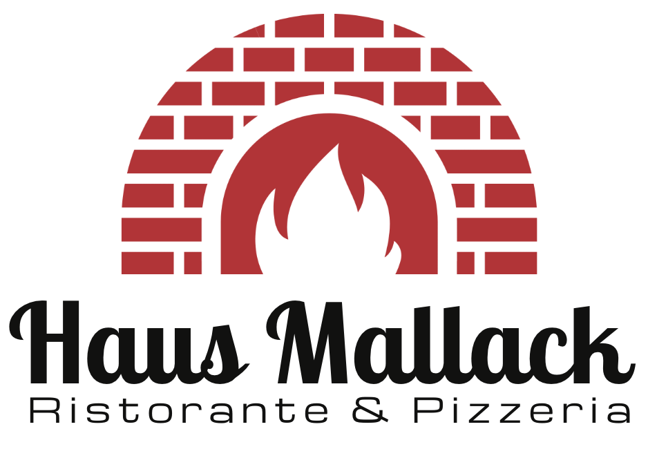
These insights shaped the design concept. The inclusion of a fire symbol not only visually represents the traditional wood-fired oven but also connects directly to what sets Haus Mallack apart. The logo combines this symbol with the restaurant's name, Haus Mallack, carefully placed beneath the icon. A brief tagline was added to highlight the authentic italian kitchen, reinforcing the restaurant’s culinary heritage.This process ensured the logo not only resonates with the brand’s values but also communicates its unique selling point in a visually compelling way.

The color scheme was a critical aspect of the logo design, as it needed to evoke the essence of italian culture while representing Haus Mallack’s authentic food experience. I opted for a palette inspired by the colors of Italy's flag—green, white, and red—but with a modern twist to avoid a stereotypical “italian” look.
This color palette creates a balance between tradition and modernity, capturing the essence of Haus Mallack’s authentic italian roots while giving it a contemporary edge.

Typography played a key role in maintaining consistency across Haus Mallack's visual identity while also ensuring readability and functionality.
The company had already selected the primary fonts for their main signage, and I incorporated these choices into the extended brand materials:

These fonts were applied consistently across various brand assets, including business cards, invoices, and voucher cards, to reinforce brand recognition. For the menu, I made strategic changes to ensure better readability and a more user-friendly experience:
By combining these fonts, I created a harmonious balance between style and functionality, ensuring that each typeface supported the brand’s identity while enhancing the overall user experience.

For the menu, I designed a layout that combines visual appeal with user-friendly readability, aligning with the restaurant’s refined yet approachable atmosphere. The structure is both minimalist and functional, allowing customers to quickly find what they’re looking for without overwhelming them.
This layout prioritizes a balanced, visual presentation and straightforward navigation, ensuring that the design not only represents Haus Mallack’s brand identity but also provides a pleasant user experience.
Tool used for the logo: Figma

From the initial sketches, I experimented with different styles for the oven, combining arches, brick patterns, and fire symbols to find the perfect balance. These sketches illustrate the exploration of various oven shapes and compositions, ultimately narrowing down to a design that was both recognizable and uniquely tied to Haus Mallack.
Final Result: The final logo includes a simplified brick oven with a stylized flame inside, instantly conveying the wood-fired cooking method. The restaurant’s name, Haus Mallack, is placed beneath in the warm, welcoming font Lobster Two, with a tagline in Michroma to emphasize the authentic italian kitchen. This combination of iconography and typography not only represents the brand’s values but also communicates its unique selling point in a visually compelling way. Keeping everything consistent

Tool used for the menu: Canva
The original menu design, as seen in the "before" images, was straightforward but lacked strong branding and visual engagement. It was clear and functional, but the layout did not fully capture Haus Mallack’s italian heritage or unique identity.
Final Result: The redesigned menu features an updated layout with visually distinct sections and a consistent color scheme that enhances readability and reflects Haus Mallack’s authentic italian atmosphere. The use of strategic fonts and elegant formatting ensures that the menu not only looks professional but also offers an improved user experience.
Typography:

The original design lacked consistency with the branding guide lines.
Final Result: For the new business card we have chosen a background color beige #F7F4E5 as seen on the menu. The logo was implemented on the front side, the business information on the backside, with the modern and elegant font Glacial Indifference, a green #018E6E line to separate the information sections.
Why the pizza on the top corner?
To create a memorable and engaging design, a quarter slice of pizza was strategically placed at the top corner of the card, with its mirrored reflection on the back. This thoughtful detail serves as a subtle yet powerful branding element. The visible pizza slice is a consistent reminder to guests, sparking recognition and connection whenever they're opening their wallets.


WORK IN PROGRESS
WORK IN PROGRESS
